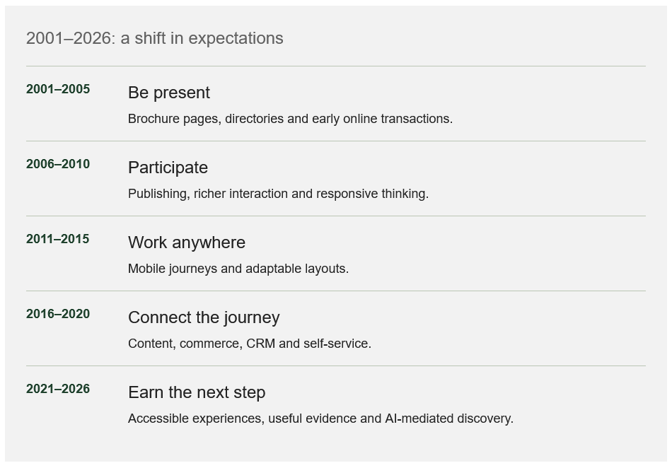
In the early 2000s, putting your company online could feel like the achievement. A homepage, a few service pages and an email address established a presence. Today, visitors arrive expecting answers, evidence and a usable next step.
The last 25 years were not a tidy sequence of replacements. Brochure sites, online shops and sophisticated applications still coexist. What changed was the range of tasks websites could support and the expectations people brought with them.
Responsive design, a term coined in 2010, helped move the discussion from separate desktop and mobile versions towards layouts that adapt. That was a change in thinking as much as technique: the visitor’s device should not dictate whether the service works.
The next challenge is equally practical. AI-mediated discovery may bring someone directly to a detailed answer rather than your carefully arranged homepage. Every important page needs enough context to stand on its own.
Before adding the next feature, ask which expectation your site still fails to meet. A reliable form and a clear explanation may contribute more than a fashionable interface.
A number worth understanding
2010
The year Ethan Marcotte coined ‘responsive web design’. The periods above are an editorial overview, not dates when every business adopted each approach.