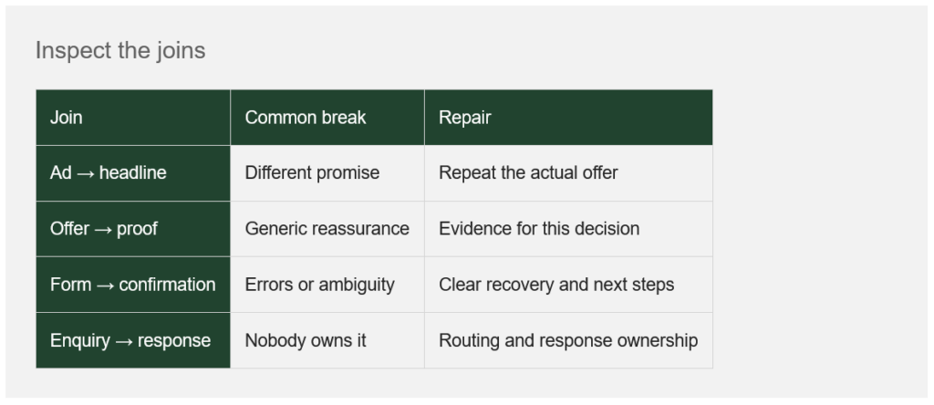
A strong ad earns a click by creating an expectation. The landing page must continue that expectation, explain the offer and make the next action feel reasonable.
Start with message continuity. If the campaign promises a sector-specific consultation, the destination should explain that consultation. A general homepage forces the visitor to reconstruct the connection.
Place relevant proof near the decision it supports. A testimonial about friendly service may not answer a buyer’s concern about implementation risk. Form fields should match what you genuinely need at this stage.
Give validation the same care as the headline. A rejected phone number, lost information or unclear error can undo the work above it. Test unsuccessful submissions and confirmation states, then check that the enquiry reaches someone who can respond.
Watch the transitions on mobile. A layout shift can move a button while someone tries to tap it. Google’s good-experience benchmark for cumulative layout shift is 0.1 or less, assessed at the 75th percentile of visits.
Optimise the complete chain. A beautiful page connected to an irrelevant offer or an unmonitored inbox remains a weak acquisition system.
A number worth understanding
≤0.1 CLS
Core Web Vitals ‘good’ threshold for visual stability at the 75th percentile. A technical benchmark, not a conversion guarantee.